CLEAR PURPOSE: Every element serves a distinct communication goal instead of filling space.
STRONG HIERARCHY: Size, weight, and contrast lead the viewer’s eye to the most important information first.
INTENTIONAL TYPOGRAPHY: Fonts are easy to read and match the mood, tone, and voice of the brand or message.
AUDIENCE ALIGNMENT: Colors, images, and styles fit what the target audience expects and responds to.






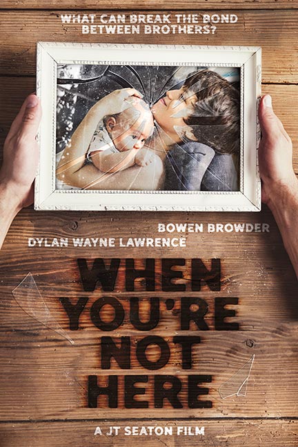


The poster art [below] started with a single photo taken on the set. The image was enhanced in Photoshop using: sky replacement, lens flares, and light leaks.

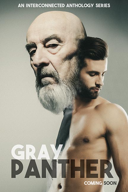
The poster art [below] was created using various stock images – compositing them together to produce the finished design.